 blocks, dry our blocks"...LOL They came out beautifully. Nice and crisp, clean and brighter.
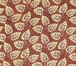
And, the 2nd pic is of the fabric I picked out on Friday, at Charlette's Web quilt shop in Stillwater, MN. It's a Civil War line, I believe, called Remember When? It's the one I like best.
The clerk has been helping me, and pretty much 'steered' me to a soft blue gray, which seemed to work the best of what there was there(on sale by the way *VBS*-40% off). And as it turns out, she may have been right......I want any/all of your honest opinions...please! The next two pics are of unwashed blocks laying against this fabric and then again a FQ of the blue gray I bought. I can still get the blue gray, DD would pop in on Monday and snatch me up what I need if I ask her(I already did, just in case).

 Here are the choices. I think the blue looks good, but it seems washed out. Maybe that is the look I should go for...I'm just not sure....help!!
 Last picture here...my loot. Everything was 40% off, which means I got ALL of this fabric (3 yards of the red/brown leaf) and a yard of the dark red Buggy Barn across the bottom, and the 4 FQ's for $28- amazing! In this pic you can see the blue gray up against the leaf print. Then a gold, a soft gold tan and a green with floral...very CW-ish I think. My packages of brushes from Michael's are there too. They cost almost as much as the 6 yards of fabric.
I had a wonderful time with DD, a nice lunch and fun shopping at Michael's and the new to me quilt shop. I'll definitely go back!


.JPG)


31 comments:
What a fun picture of your "Wash Day." I bet they smell wonderful from the fresh outdoors, too!
Great shopper, you are, Finn!
Hmmmm. Of the two I think I prefer the leaves, the other is too quiet and surprisingly, drab. Glad you had such a fun day, did the rust come out?
I like the look of the leaves with your blocks. I think that if brightens them up a bit. I love the red Buggy Barn print!!!
Oh Finn, how fun your 'laundry days' are!!! :D I want to come play 'house' with you!! :) You did an awesome haul on your goodies -- excellent fabrics at excellent prices!! Way to go!! :D Honest opinion on the fabric, right? Okay, THE LEAF FABRIC. I love the leaf fabric---and I love it with the 9-patch blocks. :D (Just MHO LOL)
Got to be a vote for the leaf fabric from me too. the other seems to wash out the blocks. You would think the red would overpower them but it doesn't.
the blue gray makes the 9-patches stand out. the leaf print draws attention to itself. Just depends which you prefer.
If there are only these two to choose from, then definitely the leaf fabric. The blue is just too washed out. But if these were my blocks I think I'd keep looking. (I'm sure that's NOT what you want to hear.) I love the leaf print - I've not seen it before, how did I miss it? But it seems a little bit too strong and overpowering to me. All I notice is it and not the blocks. These blocks have waited this long - they can wait longer for the perfect fabric. JMHO of course. If you want to get started on them now, then definitely the leaf print.
What a great picture of your "washday!"
The blue is too faded I think, the reddish color of the leaves works better, but I think the leaves are too busy.
The blue-gray appears more in keeping with the subtlety of the patches. While the rusty leafy is lovely, it kinda overpowers the blocks which, IMHO, are very soft and pretty.
Now watch -- EVERYONE will love the leafy, except me! I am sorta thinking of maybe looking more, or ... can you brighten it a bit with a narrow border treatment of the leavy rust?
Blu gray all the way. What's wrong with washed out?
The leaf print reminds me of the antique quilts I recently posted on my blog. Specifically the Turkey Tracks quilt. I like the idea of a leafy print, but not that one. I vote for keep looking.
I certainly do remember "this is the way we wash our clothes", now, thanks a lot....it's stuck in my mind and I'll be singing it the rest of the day! : )
My choice is the leaf print. Never enough red in a quilt for me.
Annie
the leaf print and I agree with Annie-never enough red in it for me. It makes the blocks pop.
*argh* I was all ready to put my vote in the 'leaf' column . . . then I read through the previous comments and have to jump on the 'keep looking' bandwagon. It that really isn't an option - go with the leafy *s*
What about a charcoal color? I must say tho, they remind me of work shirts so maybe a farmer's denim color?
Both looks are fine, but I prefer the leaf fabric myself. But then, I don't have much of a subdued personality! LOL Best of luck in making your final choice!
I like the first choice. The rust with the leaves, it seams to add punch to the blocks. Which ever you decide will be wonderful.
I vote for the blue/gray. It's more in keeping with the soft blocks. But I see I'm overruled - as usual!
Oh, and I love your corner! What a lovely place to stitch and spend some pondering time!
I love that leaf fabric, it is so very pretty!!!
Honestly? They both work. The bluegrey really seems to emphasize the blocks and give it a dreamy/faded appearance overall, kind of like you are looking at a hazy morning impressionist painting. The red leaf brings attention to itself and makes the nine patches play supporting roles. And oddly, much more like a civil war era quilt style I've seen recently in a book I've been reading. Nothing wrong with that -- just a completely different look. Although, since I suggested a denim blue before maybe I should recuse myself ;0).
I think it comes down to what you prefer -- and what you want this to be. Either way it will be beautiful -- and it will be special!
Love your fabric purchases -- and I bow before your shopping prowess! (40% off wooo hooo!)
My initial reaction was to go with the leaf print but others have made valid points. It does rather overwhelm the blocks. I like the color but the print is busy, as someone else pointed out. The blue-gray would make for a soft, calming quilt. Again, it's all in what you want for this quilt!
The blue gray is lovely Finn. It allows the 9-patches to pop out a bit more. Good choice.
Bluegray all the way! Just perfect to show off the blocks. These blocks need to be the "stars". Oh dear, I've gone completely space crazy. LOL
Blue gray makes the blocks stand out and makes it look like an older quilt. Almost historic.. Great reading. Take care of those eyes.. keep quilting
I love the leaf fabric and my first reaction was that, but looking at the blocks laid out I would have to stay the blue and gray. The leaf calls more attention to the setting blocks and the nine patches sort of fade into themselves.
Good Morning, I vote for the darker print -- I like how the blocks seem to "come out" in the picture (at least to me).
The other fabric just appears too washed out in the picture.
Good luck with whatever you decide to do --- I can't wait to see the finished top.
At first I liked the red leaf print, but the reason I liked it was because it "screamed" at me. The blocks are sort of lost and not enhanced by it all. The blue does nothing to make your blocks stand out either - they just all sort of blend together. I think a nice rich brown or beige would work best. Just what you wanted to hear, right? Another choice!
I love that leaf print and think it makes the 9-patches POP!!! Whatever you pick will be wonderful.
Definitely the leafy red print!
I think I'm in the keep looking camp, but if it were down to these 2 fabrics, how about blue in the centre of the quilt, and the leaf squares toward the outside of the quilt? That's a thing they did in the old days.
Wow! I LOVE that first fabric! But depending on the kind of look you want the blue/grey may be the better one to use. What kind of "look" are you going for.
Post a Comment